Heron Preston Returns to Brand Roots for SS21 campaign
‘K.I.S.S.’ Keep It Simple, Stupid.

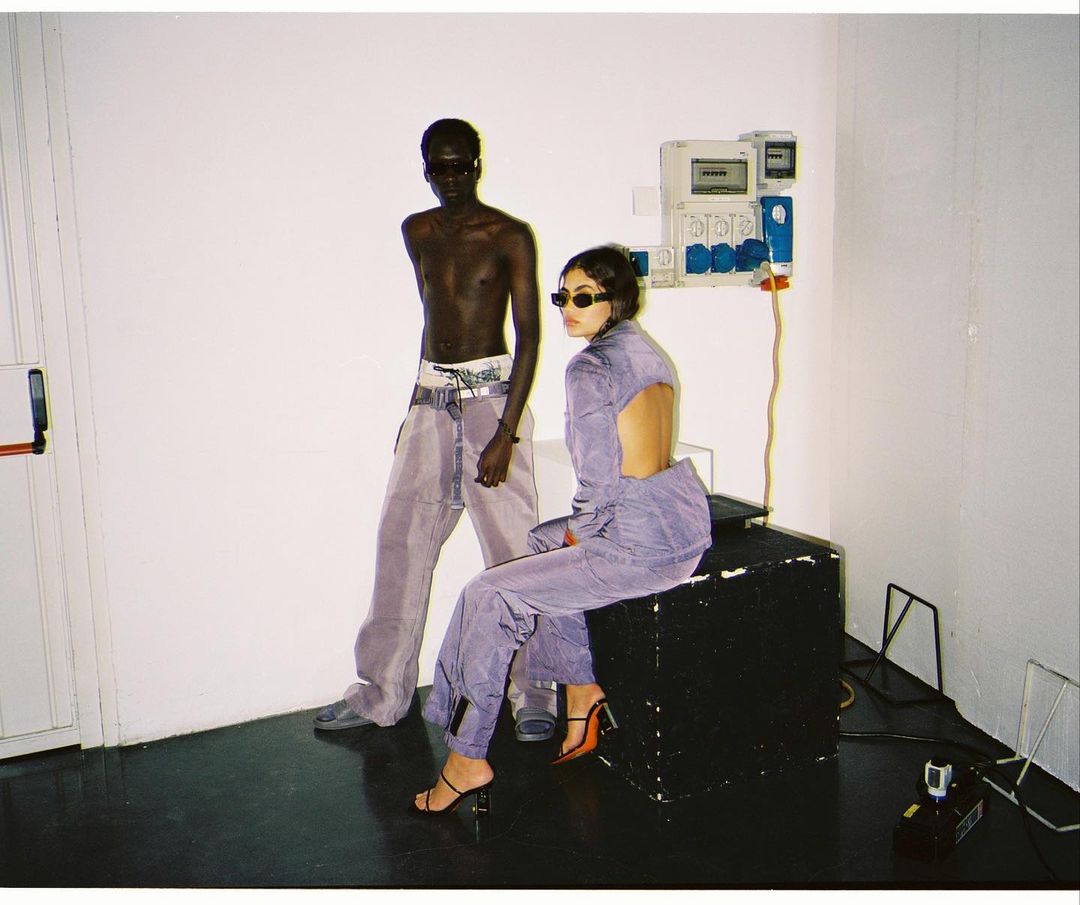
Re-centering themselves within the brand’s core ethos, Heron Preston’s spring campaign finds harmony amidst worldwide chaos. Clean cut images are reflective of the brand’s balance between forward-thinking and back-basics design, particularly emphasizing the collections themes of scaling back and focusing on their expertise around workwear, sustainability and motif-play.

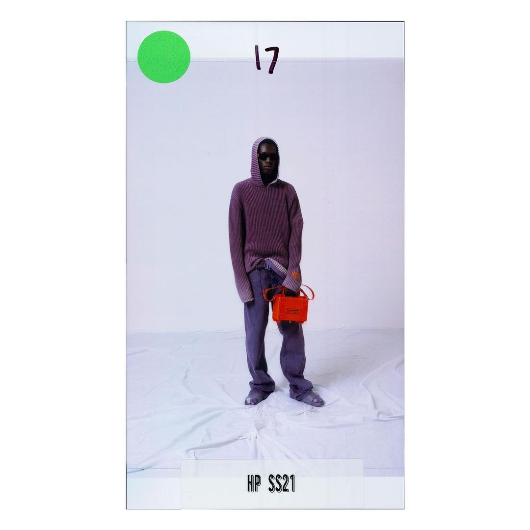
This collection may be smaller than it’s predecessors, but it is nonetheless mighty, playing to Preston’s fundamental strengths. Ready-to-wear apparel spans slouchy tailored trousers, topped off with raw denim jackets and jeans, classic shirt now cut triangular with open backs stripping back all the excess to showcase the brand’s DNA. Patchwork pants are paired with neutral browns and beiges, while icy purples and bright blues sneak into the mix giving us a taste of spring.
Brand-coded accessories follow functionality and workwear forms, such as hard-shell handbags taking the shape of drill kits, or computer cases you’d imagine NASA field scientist to use. Of course, it wouldn’t be a Preston accoutrements without the signature orange tab logo.

This collection is Preston’s latest commitment to upholding sustainable solutions in fashion, where fleece and jersey garments are made entirely from organic cotton, activewear pieces are treated with antibacterial technology and weaved in recycled nylon yarn. Heron Preston SS21 operates outside the boundaries of convention with innovative ecological materials, alongside it’s respective campaign— the brainchild of an impressive team of creatives.
View the full campaign below.


Discover More