Samuel Ross of A-COLD-WALL* Talks New Collaboration with Acqua di Parma
The British creative chatted with V in Miami to talk about revitalizing a heritage fragrance house with fresh takes on scent for a new generation
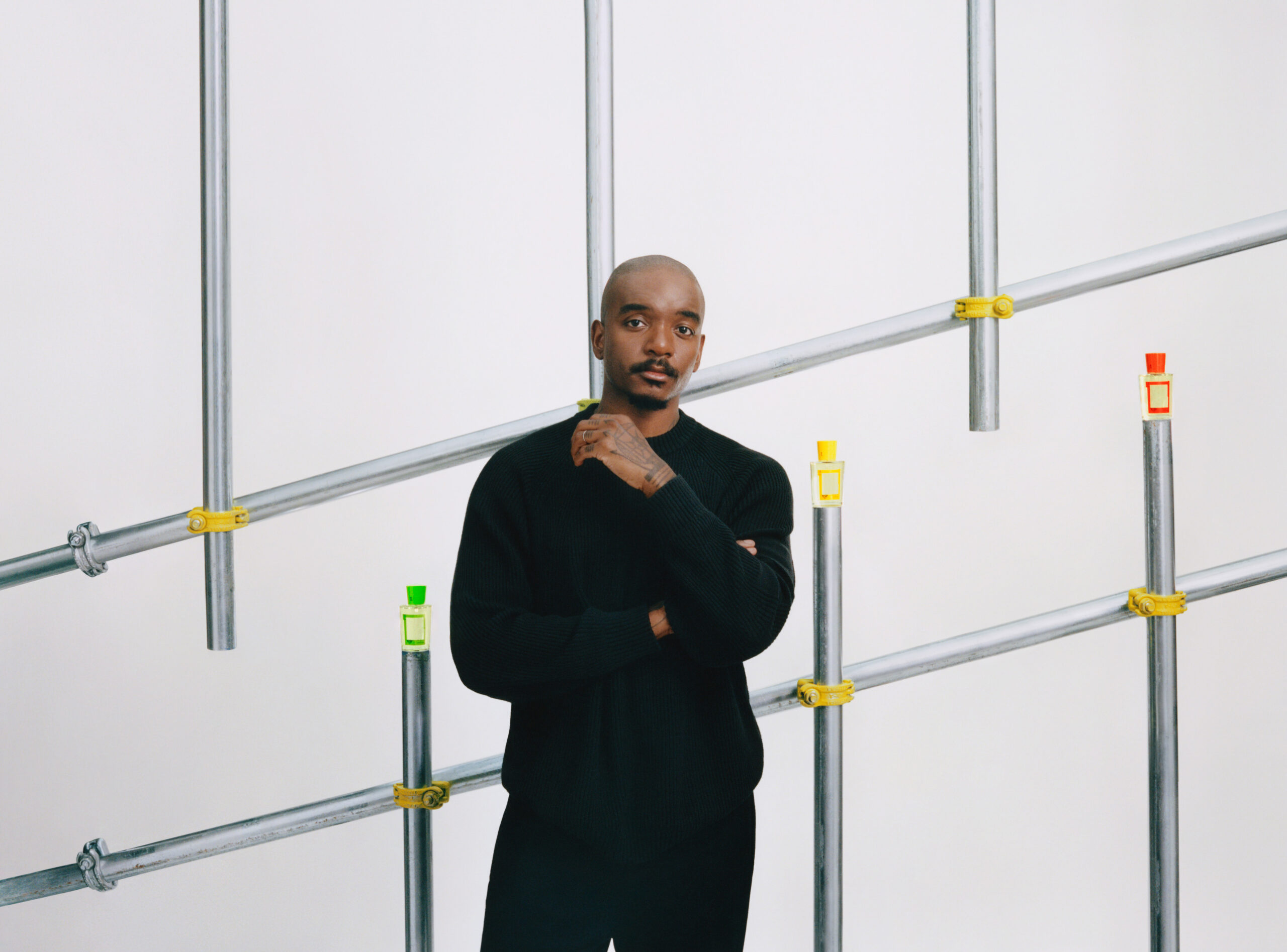
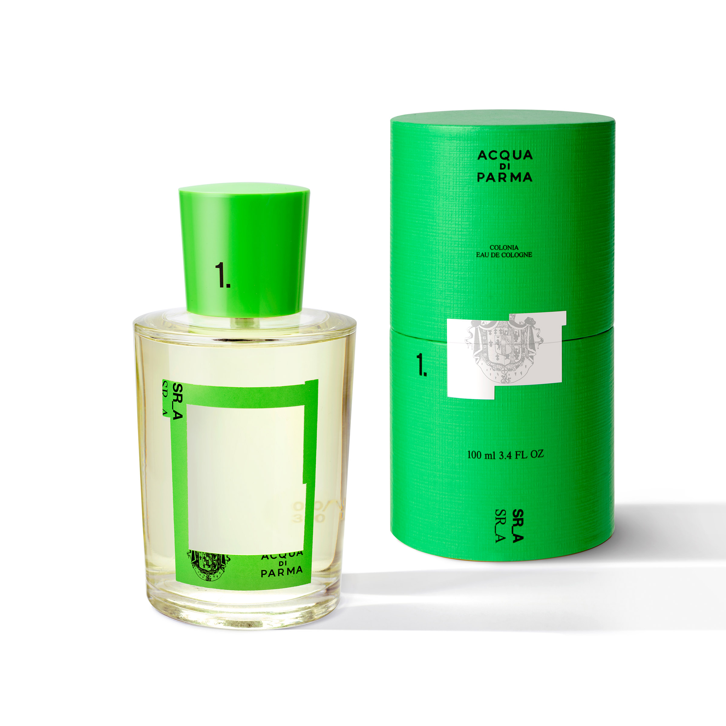
How can one redefine the look and purpose of fragrance within one’s own space? That is a challenge that Samuel Ross is taking on with stride. The designer, creative director, and artist best known for his brand A-COLD-WALL* and design studio SR_A (Samuel Ross and Associates) has been tapped by legacy fragrance house Acqua di Parma on a new type of partnership. Far beyond a limited scent creation, what the coming together between Ross and Acqua di Parma signals is a true collaboration—one rooted in respect for history and unrestricted creativity, while also imagining up a future for a brighter tomorrow. Crafting up a new design for the bottle of the house’s most iconic scent, Colonia, the Colonia Limited Edition, designed by Samuel Ross comes to full fruition as the first iteration of a three-year partnership between Acqua di Parma and Ross’ SR_A.
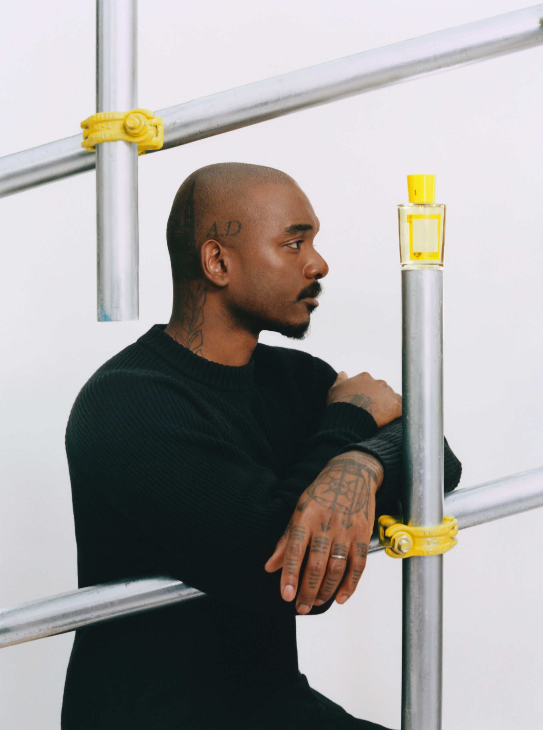
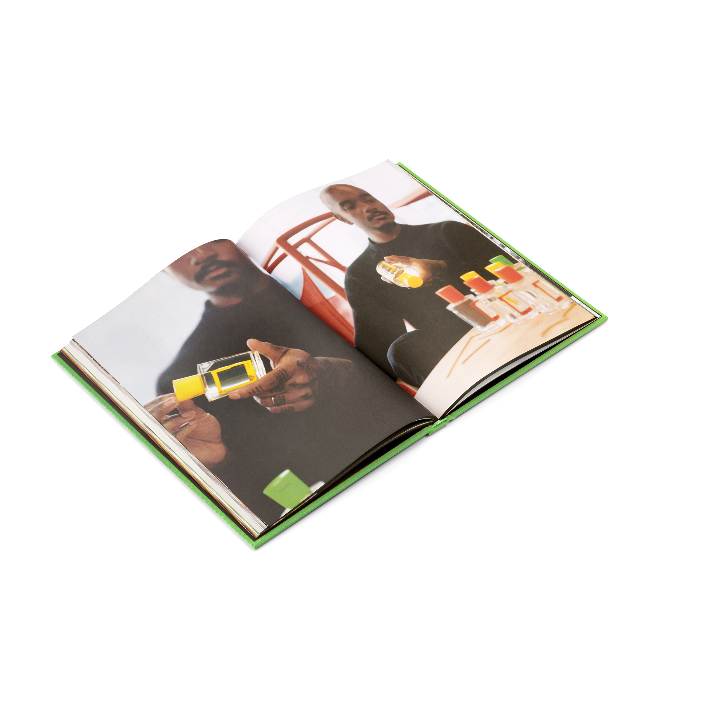
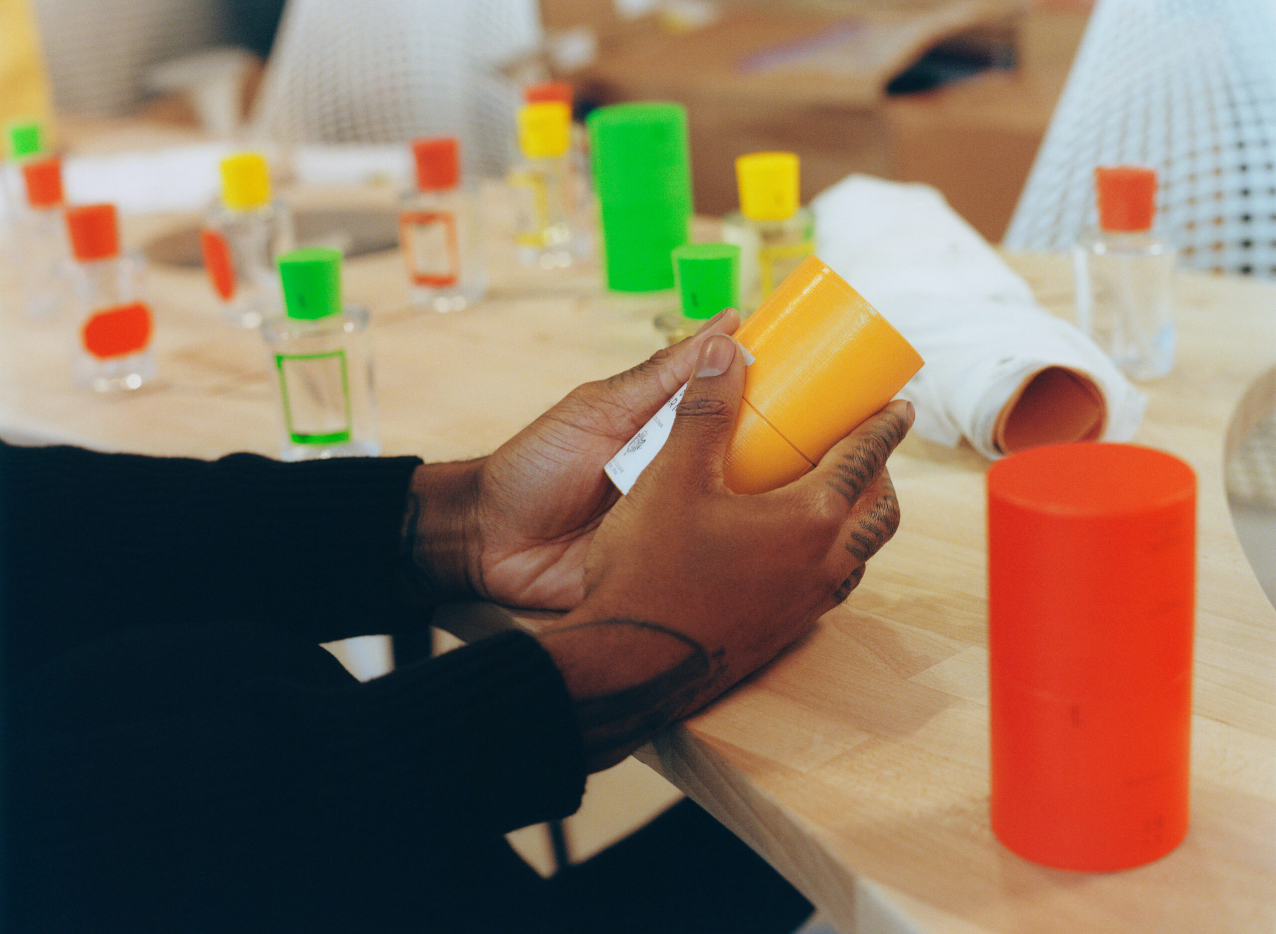
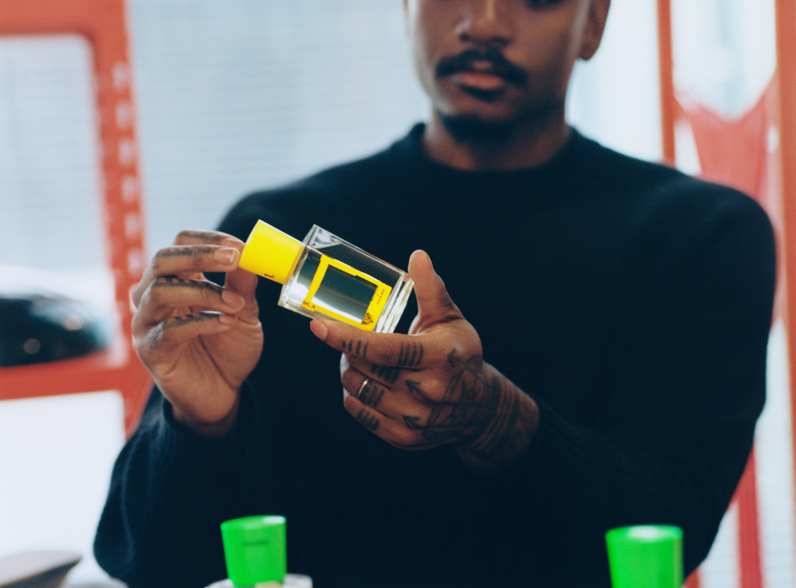
Having debuted back in 1916, Colonia Limited Edition, designed by Samuel Ross aims to celebrate the timelessness of the treasured fragrance without diluting the rich relevance of its place in today’s day in age. Looking towards architecture in a variety of cities for inspiration, Ross utilizes color play and architecture codes to develop a language of his own for the house. With a careful balance of redesigning the Art Deco bottle, while remaining true to Ross’ design DNA, the playful energy of the release taps into the idea of a cityscape view across multiple regions, with even a vantage point crafted into the bottle’s outer design. With 300 numbered, special-edition collectors bottles that span a range of the three colors in “Sun_Rise_Yellow”, “Grass_Blade_Green”, and “Ultra_Orange”, each bottle will come with an exclusive art publication featuring behind-the-scenes stories and visuals—making for a covetable pieces that goes beyond just a fragrance purchase.
Right before Ross unveiled the Miami boutique and celebrated the unique partnership at The Goodtime Hotel later that evening, V spoke with the designer to chat about how the idea came to be, some of his earliest memories with fragrance, and how scent can shape spaces.
Kevin Ponce: So talk to me about Colonia Limited Edition, designed by Samuel Ross, and how the collaboration kind of started from day one.
Samuel Ross: You know, I feel like it started before I actually started working with Acqua di Parma. Whenever I’d go into the Selfridges store, I was always drawn to their permanent retail space there because of two reasons. One, the use of one color was quite vibrant, and it was also very specific. If you think about the age of Acqua di Parma and the Colonia fragrance which dates back to 1916, I thought about how that orange would’ve cut through the 20th century and if I was to work with them, what can I offer them which honors that [history], but still moves the brand into the future. I actually met the Acqua di Parma team through the Hublot watch that I released last year and they’d seen what we’d done with Hublot and how we kind of repositioned it with the Tourbillon [watch] and they wanted to have a conversation. So I got on the phone with Paola [Paganini], who is the house’s nose and has been there since pre-acquisition so before [they were part of] LVMH, and creatively and spiritually, we just connected. It was less rigid, there was no agent in between to try and broker the contract.

KP: So it was a real one-on-one, natural partnership.
SR: It was one on one, and there was excitement on both sides to offer something that didn’t feel totally disruptive, but only advanced the brand. That was not that long ago, that was maybe only like eight and a half months ago.
KP: Oh my God. That’s a very quick turnaround for a partnership of this caliber.
SR: Yeah, we didn’t begin at the start of the fiscal year for 2023. We started in June/July. We were kind of like, ‘let’s start the first chapter’. This is a three-year partnership and this is literally the first layer within that time pocket that we had.
KP: How did you come up with the idea of three colors? It kind of feels significant.
SR: I felt there was such a capacity to tell more than one narrative in Acqua di Parma, and I felt like if I just used a single color to try and reflect the cityscape, it wouldn’t maybe encapsulate how the city makes you feel, especially when you’re talking about a dynamism between two to three cities. You know, you think of Milan as being the home of Acqua di Parma, you think of London being the home of where one of my studios is, and then I think about Paris as well. It’s impossible to exclude Paris when you think about the optimistic view of Europe. I wanted to have a different color [for each bottle], which may be reflected a different connection or feeling to each city and still felt reflective of the architects who have worked across those cities.
KP: What did you want to nail in terms of design to match the energy of the scent?
SR: I wanted to find a way to bring forward the optimism of the fragrance itself. When you think about the citrus notes, the bergamot, the lavender, the sandalwood, there’s a sense of urgency to that and it feels quite youthful. You think about the inspiration of Colonia and it’s always based on the city and it exemplifies that when you use the fragrance. It was all about finding a way to capture an intensity that reflects those who dwell in the cities. The second part was finding a way to implement an allude to the city and architecture in a really simple language so it could be accessible. And that’s where the wireframe and scaffold referencing come in label design. I thought ‘how do you show that scent can shape space?’ and I don’t think there’s a better way than having a viewfinder, which you can look through on the bottle. The liquid, of course, forms distortion, but also focuses the distortion, which captures what scent can do to a space. So there are two to three different touch points that I wanted to first establish before we started chiseling into bottle design and store design.
KP: What did the beginning point of the design look like for this? The bottle’s shape is iconic already, so how did you want to come in differently when perfecting your take on this fragrance?
SR: I spend a lot of time going back and forth between what luxury and heritage mean for our generation, for Gen Z and millennials, and what’s the right way for us to work with it. So I actually started this design process from research, and understanding the different mediums and codes that Acqua di Parma had operated with before, in terms of literature, store design, uniform, locations, and even local minerals and stones that were brought to build their stores. It was really about gathering information and then finding a way to present a version of that or a variation of that for the now, which is why we also dove into uniform, bookmaking, point of sale design, and store design. It wasn’t about reducing the brand, it was adding a new tone or texture to each of the keys, which make up the “piano” of the brand.
KP: Right. Looking in from a macro view, you seem really excited about this. It feels beyond an exciting launch, which the pop-up store design, a book, and redesigning the packaging–I feel like you kind of got carried away, in the best way possible way.
SR: *laughs* This is why the SR_A mark kind of means something, right? Because if you think of the difference between a designer and the studio collaborating, it’s down to the skillset within the studio. A designer might be specialized–and so when someone thinks of me, they might think of sculpture, art, or fashion, and I might work in one of those capacities. When you have a studio, you have these experts that form your team, right? So we have two architects who work in our team full-time, and we have a head of visual communication. So that enables us to actually tap into bookmaking, tap into the facade and retail design from an accurate depiction. That’s why you kind of see those elements come out in this [collaboration]. It’s also a testament to my second business SR_A which is starting to scale now and people are starting to see output and partnerships, which might differ from A-COLD-WALL* or in a different discipline, and for me it’s really refreshing to have these two different companies speak to two different audience spaces and category of goods. It also goes back down to the original plan, which was to have lots of things happening at the same time. All of that makes sense because it’s like building a universe. So it’s like, okay, ‘let me actually go back to the principle we use internally’—we look at like a 24-hour clock and we look at how do we have a micro effect in one’s experience within a day in the life. You start thinking about the fragrance, and then the room, and then the clothes, light, and space, and it all builds out from that type of philosophy.
KP: That’s like a real 360 approach, instead of the experience lasting for a brief moment in the day, and then you go on about your life. It feels like it’s more encompassing than that.
SR: Completely.
KP: I want to talk about your early memories of scent. What were some of the experiences with fragrances that stuck with you early on?
SR: For me, it was Nag Champa incense. My grandmother would burn it religiously in the family house in Brixton. It’s one of my first memories of scent being like an intervention to space and mood. That’s probably number one. Number two, probably within the islands in the Caribbean, St. Vincent, Barbados, I spent a lot of my childhood there. I have strong memories of floral fragrances from nature, and the sea salt from the ocean shore stands out a lot in my mind. I recently picked up some hand-rolled incense from Calcutta, and if you burn it for too long, you have a red eye, but it’s the quality of the scent that is incredible. If you go into our design studios for SR_A, it’s just piles of incense with burners that I’ve created from resin or concrete. It’s really about how scent can shape space. Tying scent to environment is really at the crux of my interpretation of Colonia.
KP: Beyond this partnership, are you hoping to kind of dabble into scents and fragrances a little bit more? What does the next chapter beyond just three years look like in your head?
SR: I feel like to a degree, scents have always been part of my journey. I think scent will always have a place in how I just want people to experience reality. If I think about even some of our early runway shows [for A-COLD-WALL*], we’d often scent the spaces like at our breakout show in London back in 2017 and showrooms. We’ve had candle releases under A-COLD-WALL* as well, so it’s almost like a non-negotiable to a certain degree. As we move forward, we are looking at concepts for SR_A, which might take shape in the form of soaps or candles. I think what’s quite interesting, as you mentioned earlier, is the volume of ideas in this first chapter is quite intense–even wiping the Instagram was great. I think that shows there’s maybe even a prospect beyond partnership and collaboration of a parallel line of Acqua di Parma for a different generation. I think that at this stage, that makes probably the most sense.
https://youtube.com/watch?v=p7-w-SjW418&feature=shares
The Acqua di Parma “Colonia Numbered Edition” Designed by Samuel Ross is now available in select boutiques globally. Discover your nearest store here.
Discover More